Timeline
Tools
Role
Overview
Sponsor
14 weeks
Figma
Lens Studio
Github
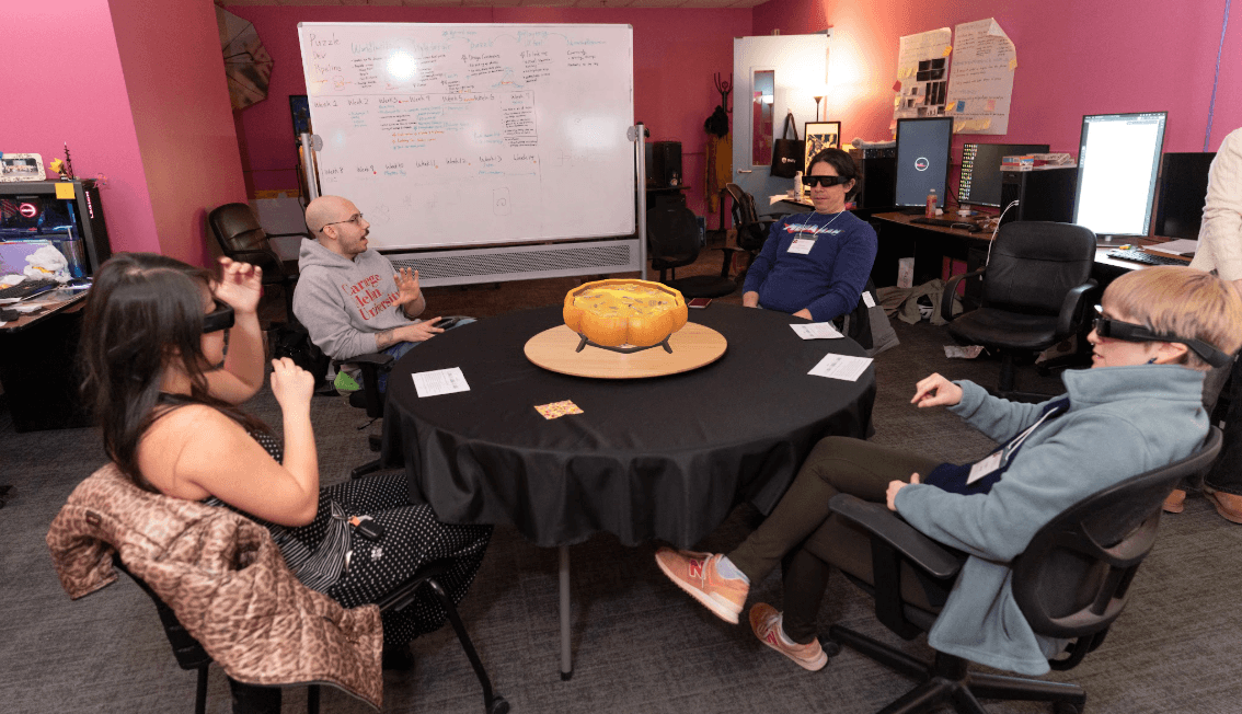
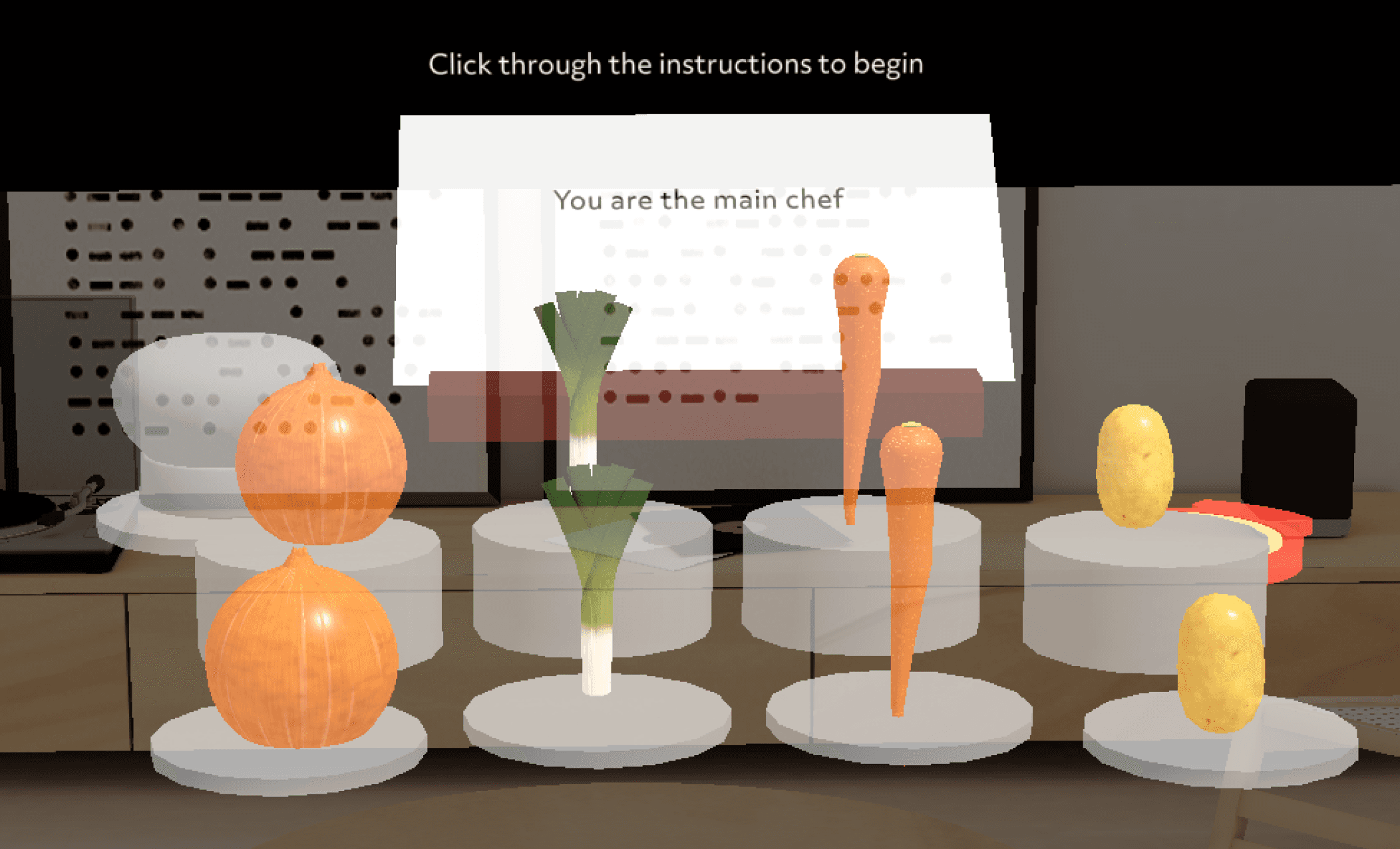
An AR party game for 3–4 players on Snap Spectacles. Designing for a shared physical table meant solving for spatial layout, multiplayer information architecture, and hand gesture interactions, all on an entirely new platform with no established UX conventions.
Designing Multiplayer Interface for a Wearable AR Party Game
UX/UI design, User testing, Prototyping
Team
1 UX/UI designer (Me)
2 Artists
2 Programmers


About the Device
About Snap’s Spectacles
Snap Spectacles are Snap's first wearable AR glasses. Although the device is not publicly available yet, our team was granted early access for educational purposes.
· Powered by Snap OS
· Supports hand gesture tracking and voice commands
· Features a 46° field of view
About the Experience
AR Party Game Designed for
Groups of 3–4 people Sitting Around a Table
The experience blends party games like Taboo! and Charades into a shared, hands-free AR environment.
One player acts as Head Chef, describing each ingredient without naming it, while the rest, Apprentice Chefs guess what goes into the pot, all designed to spark laughter and conversation before the meal.
Key Interactions
What Players Experience
Face Filters
Hand Interaction
Mix of Physical & Virtual Interactions
Immersive Visual Effects


Each player's role is expressed through AR character overlays
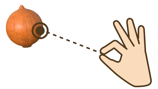
Players physically grab and toss ingredients into the pot
Digital objects blend seamlessly with the real table surface
The soup fills and reacts as ingredients are added
Design Constraints
Understanding UX Constraints
Before designing, I identified three major UX constraints unique to AR. Hand gestures required onboarding first-time users on direct and indirect pinch interactions. Unlike Meta Quest, Spectacles have a narrow field of view. Lastly, players needed to calibrate their environment before starting to ensure AR elements were correctly placed.

DIRECT PINCH
INDIRECT PINCH
Hand Interactions

Environment Calibration

Narrow FOV
Design Principles
Design Principles & Space Definition
Visual Comfort
Use 2D for text, 3D for object
Optimize for limited FOV
Physical Comfort
Hybrid of physical and
virtual interactions
Distinguish personal
& communal space
Cognitive Comfort
Use visual and audio feedback
Consider gesture fatigue
Personal space
Personal space
Communal space
45cm
110cm
Personal UI Controls : within 45cm (Near Field)
Personal UI Panels : within 45cm (Near Field)
Communal UI Controls/Panels : within 110cm (Far Field)

Communal Space
(2D UI, Indirect Pinch)
Personal Space
(3D UI, Direct Pinch)
Communal Space
The shared zone at the center of the table where all players' contributions are visible.
Personal Space
The individual UI zone visible only to you, within arm's reach (45cm). This is where your personal controls and ingredient interactions are set up.
UI Layout
Personal Interface Setup
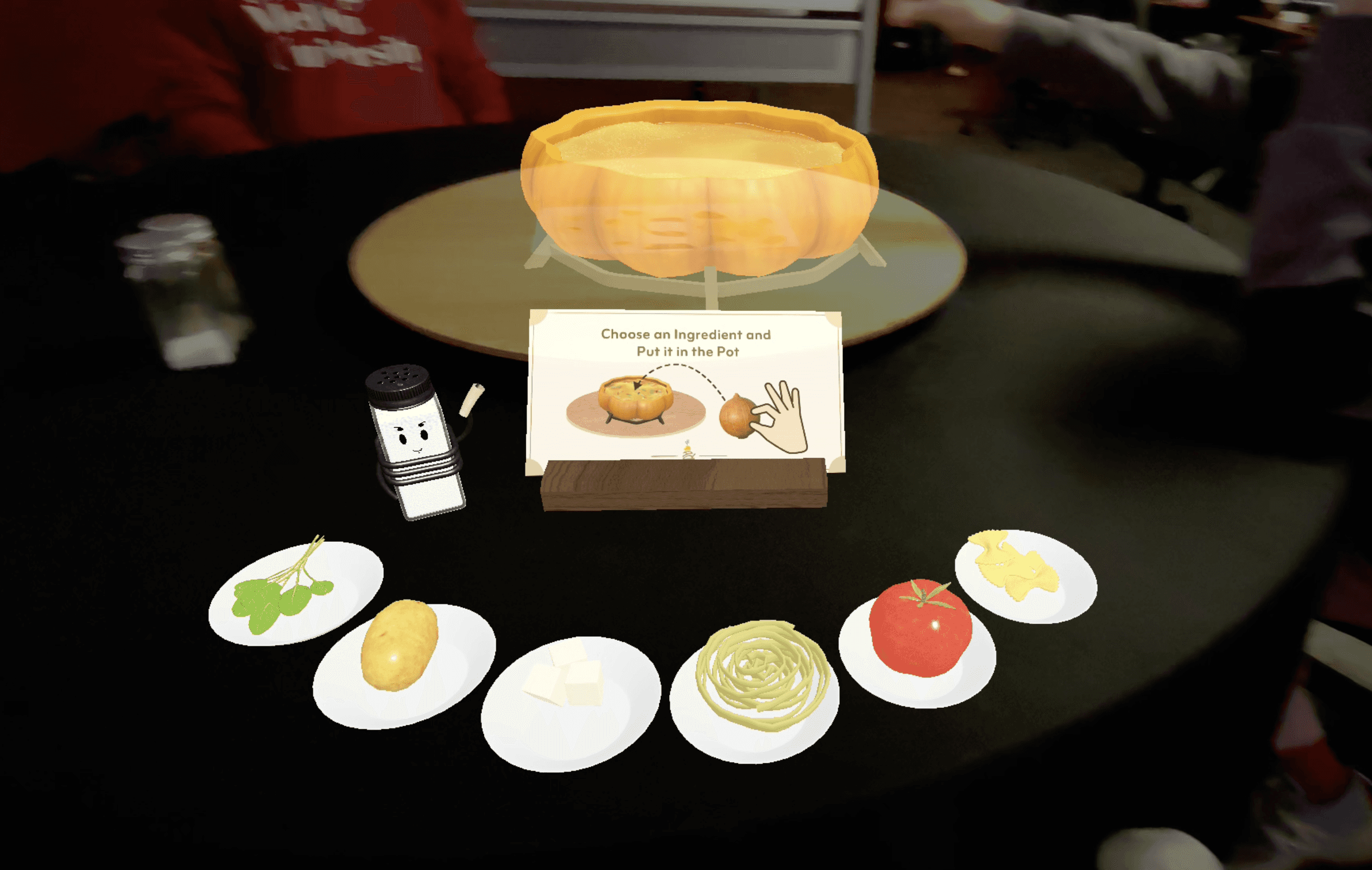

Apprentice Chef’s Interface
Chooses the ingredient to put it in a pot
Main Chef’s Interface
Explain the ingredient in one word and proceeds the game
Action Button
Instructional Panel
Ingredient Choices
Design Decision 1
Mapping Interaction Type to UI Dimensionality
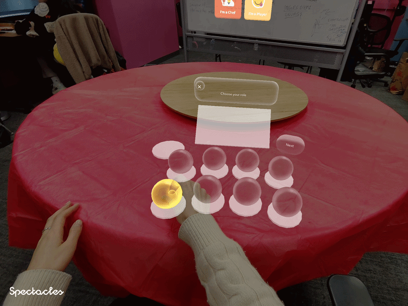
In AR, choosing the wrong interaction model creates friction. We mapped interaction type to UI dimensionality based on two factors: proximity and action weight. High-stakes game controls like role selection and environment confirmation were placed as 2D panels at eye level, using indirect pinch for deliberate, precise selection. Physical ingredient interactions were kept as 3D objects within arm's reach, where direct pinch felt natural and intuitive.
2D for Indirect Pinch
Used for high-stakes, game-level decisions that required deliberate input

Clicking Talk Bubble

Choosing Main Chef

Confirming Position
3D for Direct Pinch
Used for physical, playful interactions where instinct should guide the action

Poking 3D Button

Grabbing Ingredients
The 3D button is deliberately separated from the ingredient colliders by placing a non-interactive panel between them. This isolation prevents accidental triggers and creates a clear physical cue, a standalone 3D object in reach naturally invites direct poking.
Ingredients are 3D objects placed within arm's reach, naturally inviting players to reach out and grab them.
Design Decision 2
Finding Optimal Interface Layout
The initial layout kept objects within a good field of view, but overlapping colliders caused glitches when grabbing targeted objects. My goal was to find a layout that ...
· Eliminated collider overlaps
· Stayed within the narrow field of view.
Top View
Front View
No no zone
Natural
Stretch
Stretch
Collider overlaps
Blocks panel content
Natural
Stretch
Stretch
Within good field of view
Elevating the second row improved grabbability, but colliders still overlapped and blocked the panel content behind them.
Ver 1 : Elevated Row & Panel
Top View
Front View
Out of field of view
Collider overlaps
Panel interaction has no interfere
Separating the panel and object areas reduced interference, but spreading ingredients horizontally pushed them outside the field of view.
Ver 2 : Dispersed Ingredients with Non Interactive Area

No no zone
Natural
Stretch
Stretch
Natural
Stretch
Stretch
Top View
Front View
Closest colliders have low visibility
No collider overlaps
Curving outward eliminated collider overlaps, but ingredients closest to the player fell outside the visible range.
Ver 3 : Convex Layout

Natural
Stretch
Stretch
No no zone
Natural
Stretch
Stretch
Top View
Front View
No collider overlaps
Equalized visibility
The inward curve became the final layout. Pulling objects away from the no-go zone equalized both visibility and reach across all colliders.
Ver 4 : Concave Layout

No no zone
Natural
Stretch
Stretch
Natural
Stretch
Stretch
Design Decision 3
Streamlining Onboarding UX
In our initial playtest, our onboarding suffered from high cognitive load. Users tried to calibrate the AR space while simultaneously reading character dialogue, resulting in misaligned environments and initial confusion. To fix this, I separated the technical setup from the story flow by introducing a pre-dialogue visual guide ring on the table surface and adding clear button affordances to the text boxes.
Quantitative validation from our next playtest proved the success of this layout change. Text readability scores jumped from 3.68 to 4.19, rule clarity increased from 4.05 to 4.18, and onboarding calibration complaints dropped to zero.
Before
Talk bubble appears static and unclickable
No guidance for placing AR objects on the table
Instructions appear before objects are placed, causing confusion

After
Talk bubble clearly signals interactivity
Added guidance ring for surface placement
Reordered flow so the pot is placed first, then instructions follow
Design Validation
Measuring Design Impact Across Two Playtests
Across 36 participants over two playtests, every spatial metric improved following the curved arc redesign and onboarding restructure. I measured whether the design principles such as visual comfort, physical comfort, and cognitive comfort has been improved in a survey in 1–5 Likert scale.


Visual Comfort
+0.51 Text Readability
Physical Comfort
+0.66 UI Distance Comfort
Cognitive Comfort
-0.38 Arm Fatigue reduction
Takeaway
Learnings
• Exploring Object Detection
We initially explored using real-world objects to trigger AR effects, but after consulting with our programmer, we found machine learning-based object detection was not reliable enough. We pivoted to image markers instead.
• Exploring Image Markers
Our next approach was placing image markers on a lazy Susan, but perspective shifts caused markers to become jittery or unrecognizable when players were seated. This pushed us to rethink our spatial anchoring strategy entirely.
• Hardware Constraints Shape Design
Designing on new technology comes with real limitations. Spectacles had significant constraints including overheating, an extremely narrow FOV, and an immature platform. Syncing across devices was also a constant barrier — playtests required multiple people and sessions crashed frequently, making iteration slow.
• People Love Physical Hand Interactions
Playtesting revealed that users genuinely enjoyed physically interacting with AR objects. Players wanted to chop ingredients and hold utensils, not just pinch and grab. Given more time, I would invest further in expanding these tactile social interactions.